
LITTLE SPROUTS
Branding, Brand Collateral, Product Graphics
Branding, Brand Collateral, Product Graphics
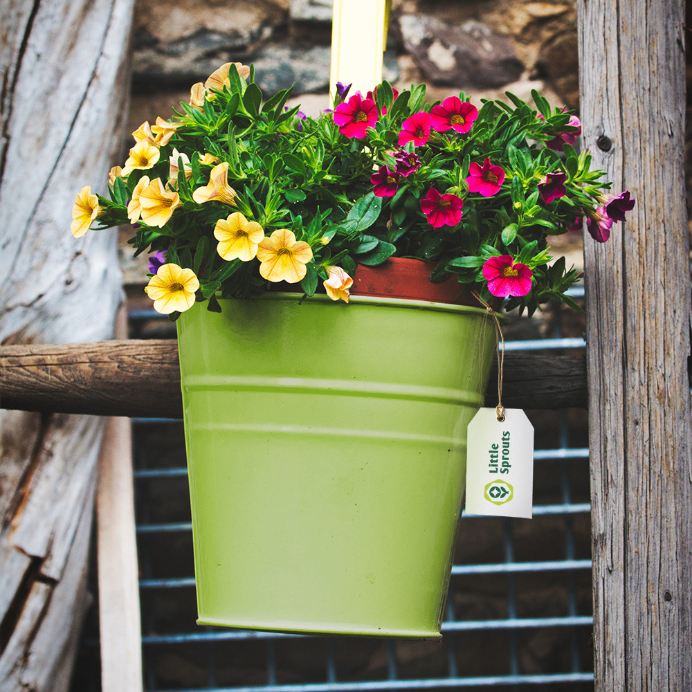
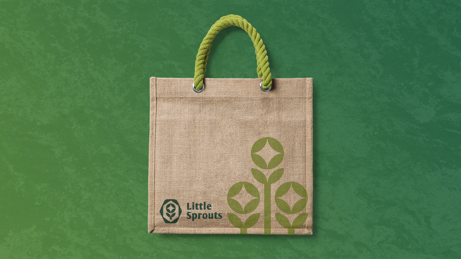
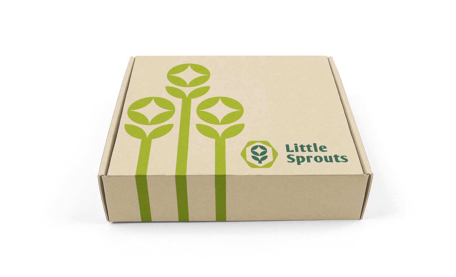
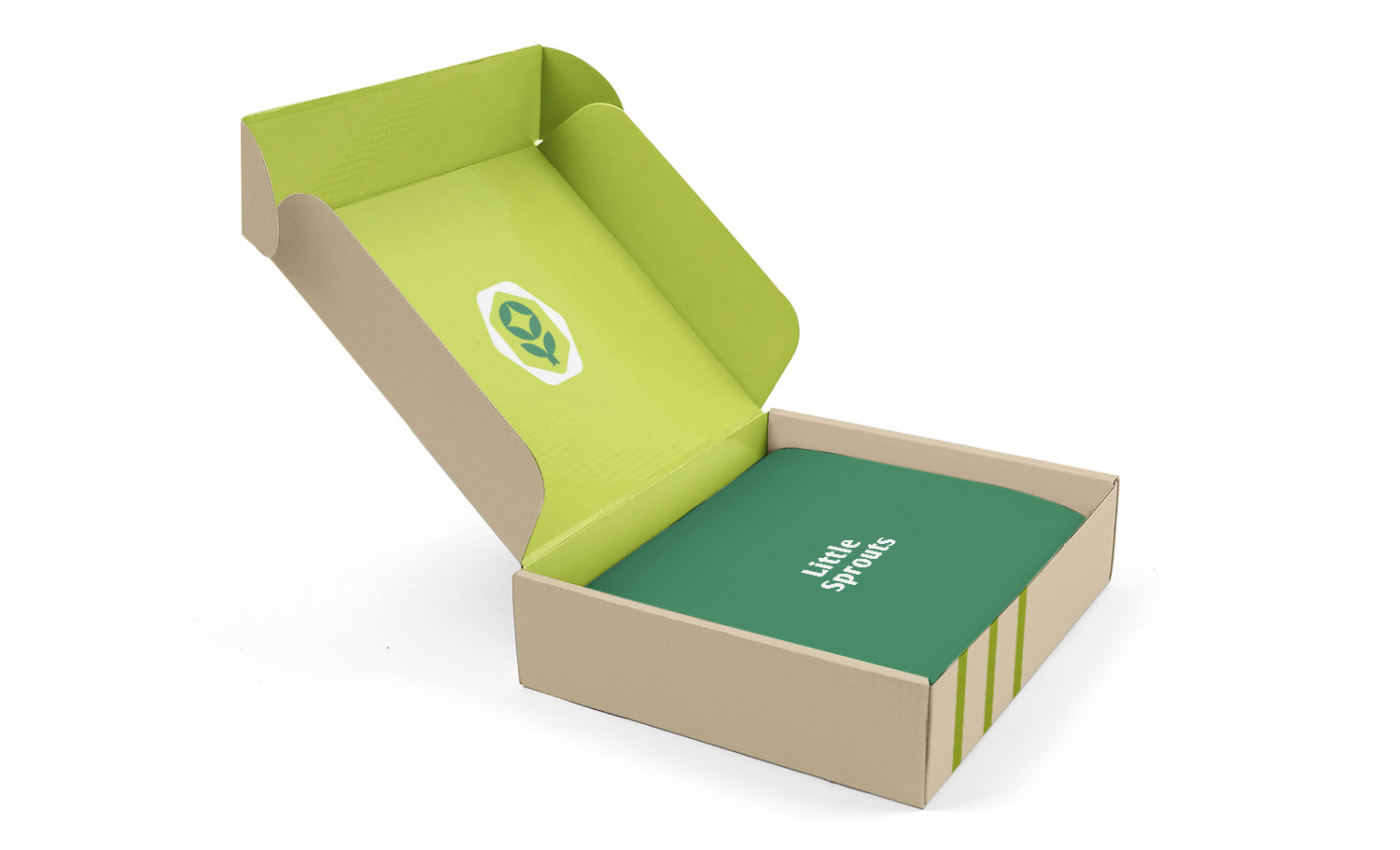
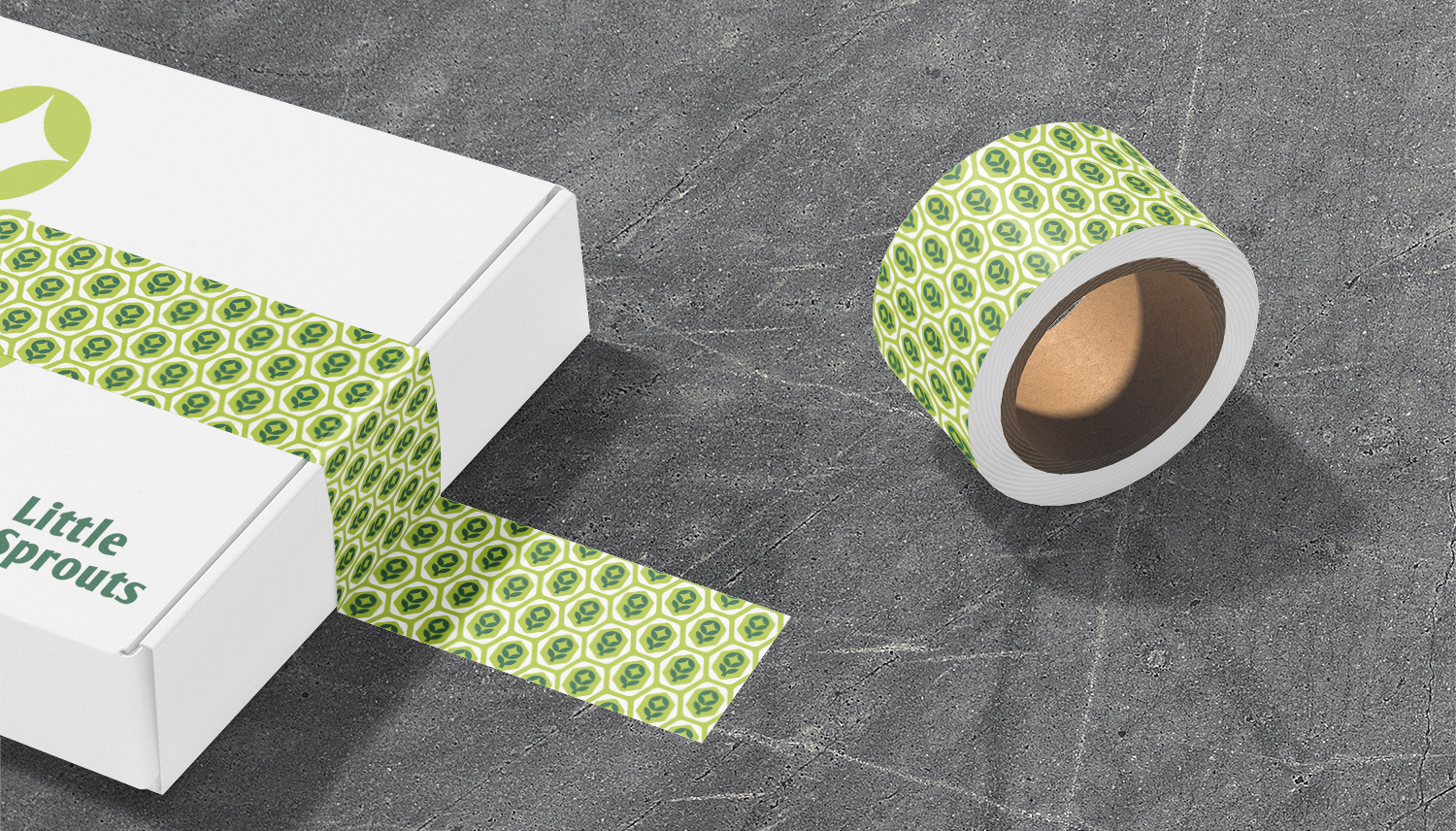
A brand exploration for a gardening subscription box aimed at children called Little Sprouts. The intent was to be both playful while still feeling sophisticated. To do this we used basic shapes to create an icon of a flower, inspired by the proportions and stance of a child raising it's arms as well as curved and diagonal lines to give a sense of energy/life. As part of the exploration mockups of boxes, bags, tape, tags and caps were developed along with some simple brand related graphics and pattern.